
As Dialogue evolves, the visual identity should also evolve to reflect the brand’s growth. Without straying too far from our core branding, it is important that we regularly refresh our visuals to delight our client base and set us apart from our competition.
This year, we aim to enhance the premium look of the Dialogue brand to better reflect the high quality of our services and to position us as the main leader in the industry. We want our brand image to be bolder and to make a more powerful and memorable impression. We will do so with the help of rich imagery, a focus on our product, and eye-catching graphics.
_____________________________________________________________
Product demos
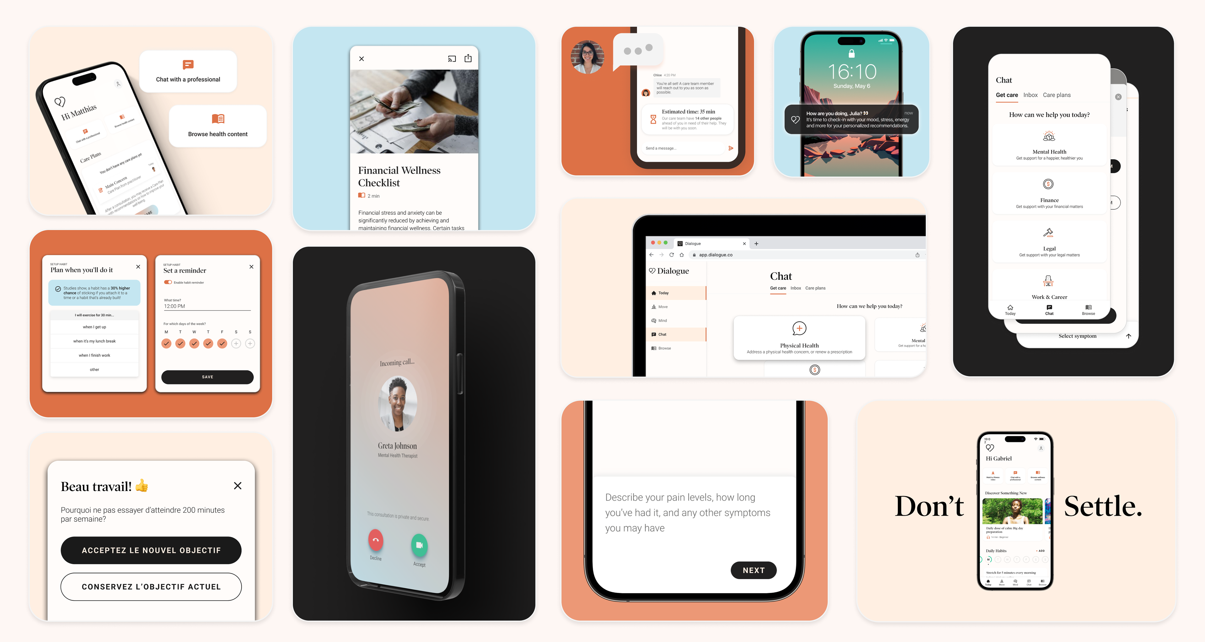
In alignment with our positioning narrative, this direction aims to help the visual representation of our product premium and innovative. What does this look like?:
- Products on clean, brand coloured backgrounds
- Focus on UI. Highlighting certain components on the screen, rather than showcasing the entire device
- UI can be featured as a stand-alone or within a mock up
- Corners should always be rounded, and devices can be positioned at different angles for artistic flair
- No devices from before 2020, all mockups within one document should be the same device
- Stand alone UI should have a thin grey outline around screens and components
_____________________________________________________________
Focus on typography, layout, and image interaction
With this new direction, we’re aiming to highlight content in a clear and concise manner. We are not focusing on one specific element, but making sure that each component makes up our brand.

What does this look like?:
- Clean, type focused designs. Can be on plain backgrounds.
- Bento layouts and layering. Bento layouts help users focus on information that’s important rather than accompanying graphics
- Minimal editing to images. Only slight background edits to make subjects pop and cater to accessibility. Otherwise, we always want photos in natural lighting and look candid.
- Strategic typography placement. Text and image layering, paired with simple typography
- Any surrounding elements should tell a message or help highlight content
- Composition themselves should not only be a means of delivering content, but a piece of art in itself
- Using spacial judgement to determine text orientation
- Take note of colour contrast when adding text over images. Make sure that the background colour closest to the text colour has a contrast ratio of at least 4.5:1.
_____________________________________________________________
Friendly, content-highlighting graphics
Highlighting graphics not only help emphasize content, but they can add an approachable flare to the design. These graphics can help make designs more enticing; which is especially useful for promotional materials.
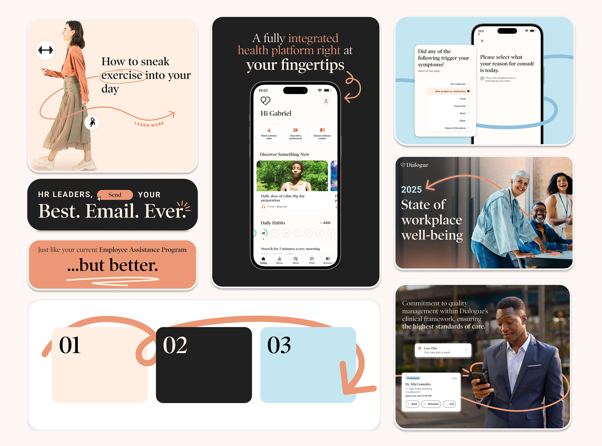
What does this look like?:
- Leading lines and arrows. All lines should have rounded stroke caps
- Graphics should highlight content, attract the viewer’s attention to a specific part of the design, or to complete the composition
- Graphics should highlight content, attract the viewer’s attention to a specific part of the design, or to complete the composition
_____________________________________________________________
Non-linear gradients
Let’s make Dialogue pop! It’s time to drift away from simple design tactics that can be made on Microsoft Word.
Linear gradients are mechanical and can appear cheap, while soft rounded ones better reflect light-to-dark transitions in a warm and inviting way. Non-linear gradients also allow us to use more brand colours while maintaining a premium feel. Let’s show off our brand colours in an illuminative and inviting way!
Linear gradients are mechanical and can appear cheap, while soft rounded ones better reflect light-to-dark transitions in a warm and inviting way. Non-linear gradients also allow us to use more brand colours while maintaining a premium feel. Let’s show off our brand colours in an illuminative and inviting way!