__________________________
Colour Palette
Using colour appropriately is one of the easiest ways to make sure our materials reflect a cohesive brand.
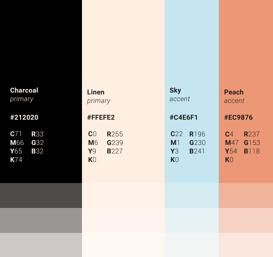
The two primary colours are charcoal (#212020) and linen (#FFEFE2). The secondary colours are sky (#C4E6F1) and peach (#EC9876). Secondary colours should be used to add interest, warmth and pops of colour.
Shades of the colours can be used if needed but 100% opacity is recommended. Ensure that there is enough contrast when layering colours on top of each other.
__________________________
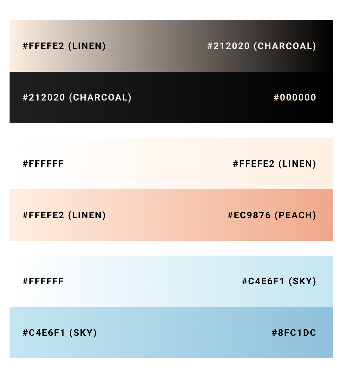
Gradients
Using gradients within the colour pallet is also acceptable, but it is important to remember that shades between gradients should never be used as complete fills. Only official brand colours should be used for this purpose.