__________________________
Logo Lockup
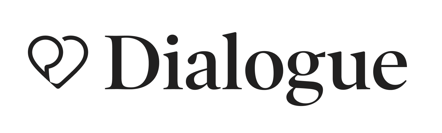
The wordmark next to the logo icon is the primary version of the logo and it should be used whenever possible unless shape or
length creates an issue. As the primary mark, it should be used often and for principal uses such as website header and letterheads. The provided logo lockup file should be used to ensure elements remain consistent.
length creates an issue. As the primary mark, it should be used often and for principal uses such as website header and letterheads. The provided logo lockup file should be used to ensure elements remain consistent.
__________________________
Contrast
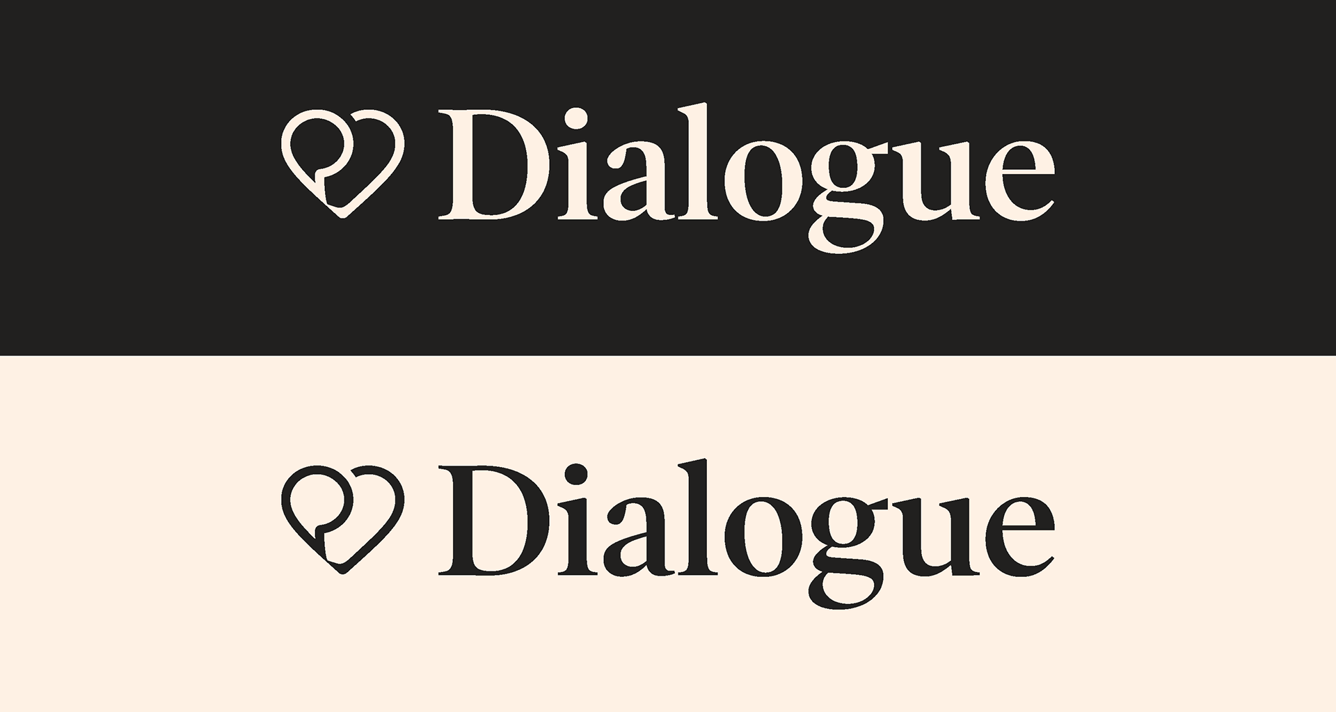
The logo should have good contrast when placed on a background whether it be an image or colour. When the background is dark, the logo should be set in linen. When the background is light the logo should be set in charcoal.

__________________________
Wordmark
The wordmark speaks to the expert and principled attributes of the brand.
The wordmark should never be used alone. Always use with the heart icon.
The wordmark should never be used alone. Always use with the heart icon.

__________________________
Logo Icon
The logo icon is a speech bubble inside a heart. It embodies the core values of health and telemedicine.
The logo icon should only be used on its own when the brand is clearly visible or has been well established elsewhere on the page or in the design.
The heart logo can also be used when space is limited, for example, on social media or favicons.
__________________________
Positioning
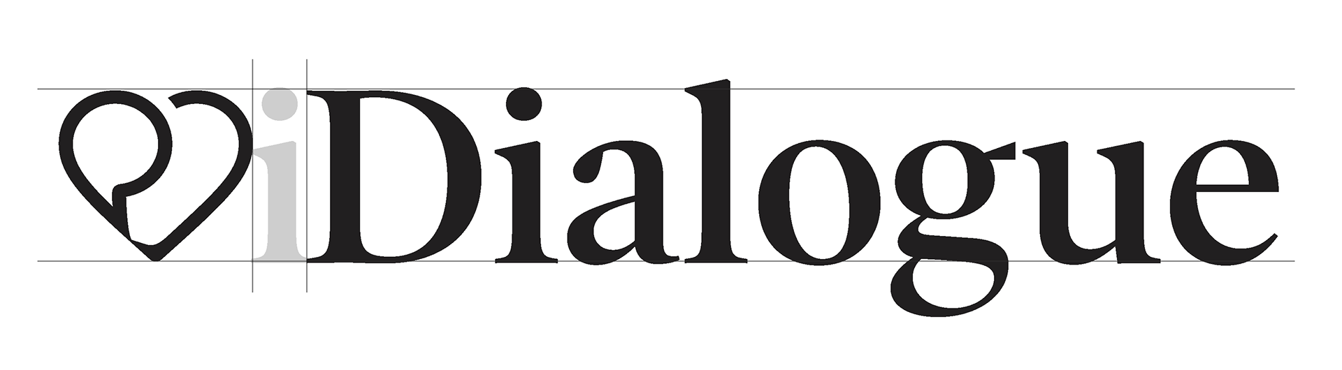
The provided logo lock up file should be used to ensure the spacing and positioning in between elements remain consistent.
The heart icon should match the height of the capital "D" and should maintain the spacing of the lower case “i” between the wordmark.
__________________________
Clearspace
The logo should always have plenty of space around it. Here is the recommended ratio for how much space to allow around the logo.
__________________________
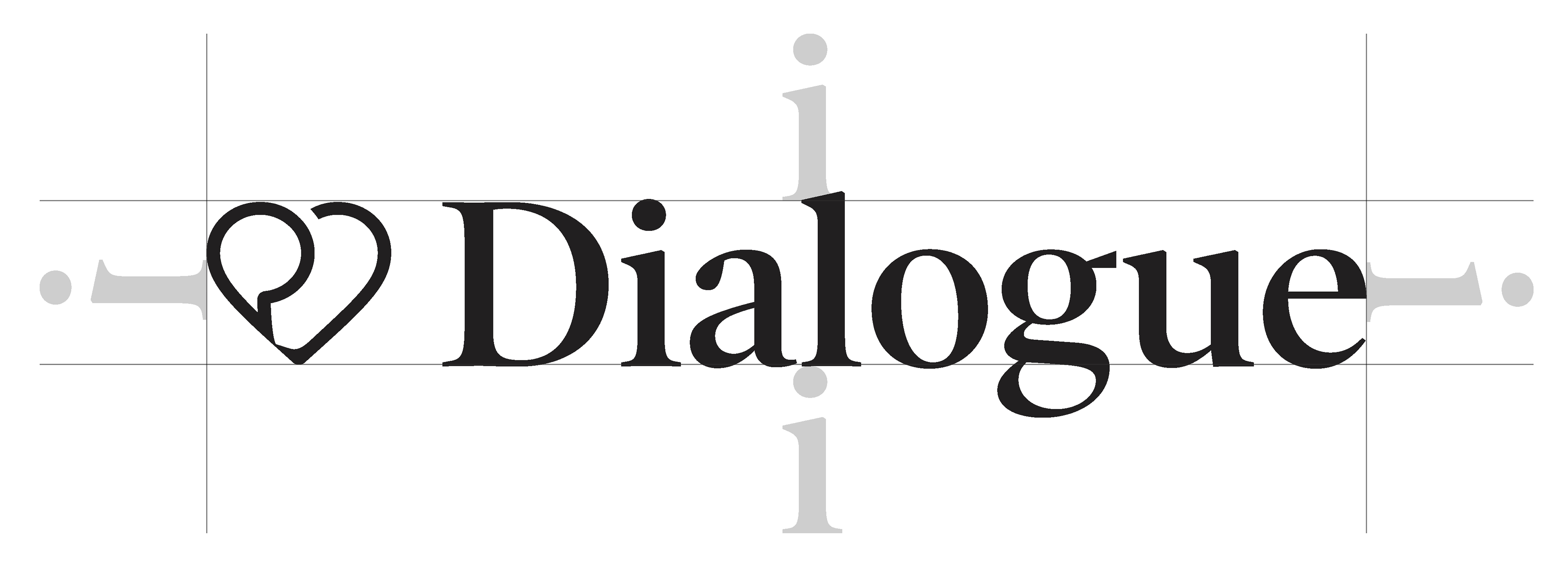
Space of the "i"
A field of space around the logo based on the x-height of the “i” is the minimum distance that should be used.
__________________________
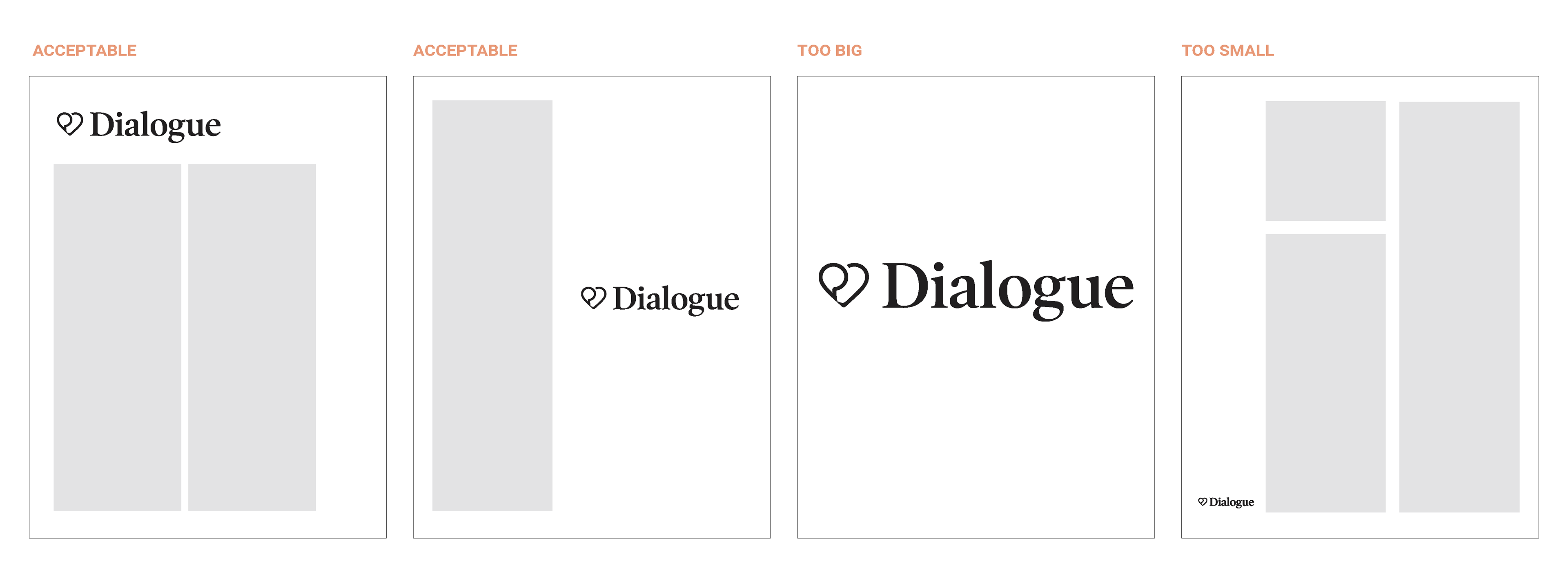
Scale
We want our logo to state itself boldly, and in a friendly manner. The logo should stand confidently in its space and call attention to itself appropriately according to its context.
Like Goldilocks, the logo doesn’t ever want to be too big or too small. If too big, it becomes intrusive and overbearing, but too small, it feels insignificant and timid. The minimum size in which the logo can be used is 1/2 an inch.
______________________
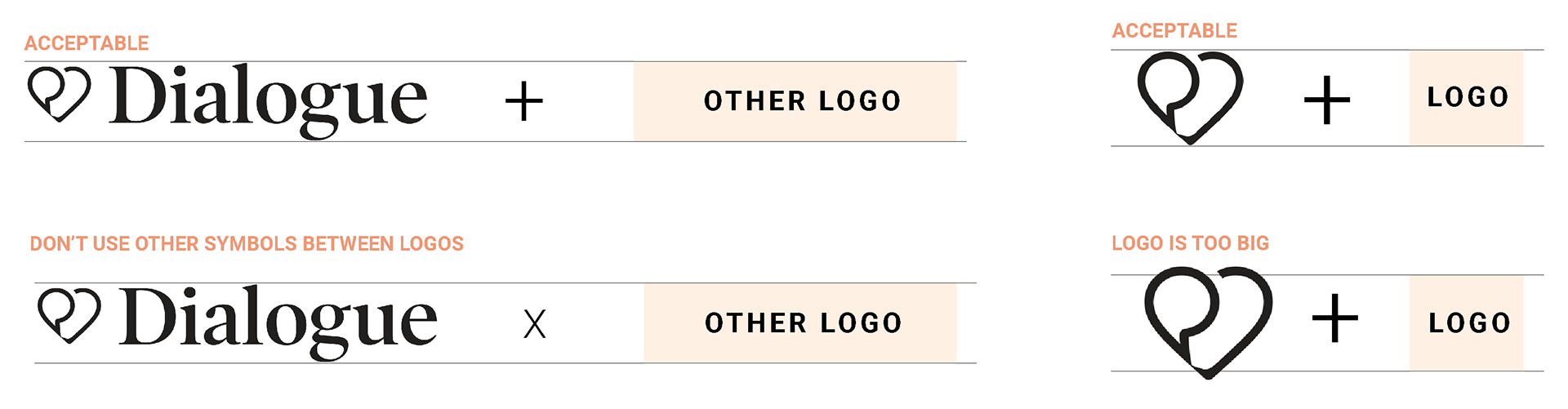
Co-branding and partnership use
The Dialogue logo can be used alongside that of another company for co-branding or partnerships. Ensure that the two logos are the same size and have a '+' centered between them to show collaboration.
__________________________________
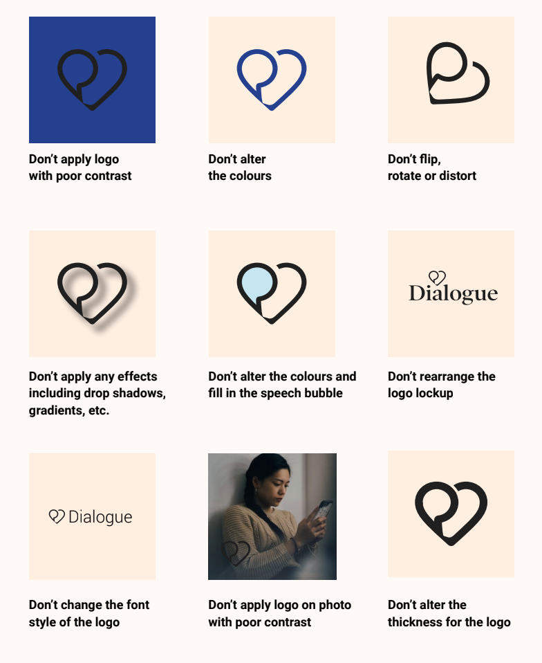
Unacceptable logo use
We ask that users respect the logo by keeping it in its pure form and within the rules specified in this guide. Be wary when using the logo not to alter, tweak or take creative freedom that breaks the rules set out in the guide book. The following are merely a few examples of practices that would violate the logo and Dialogue brand.