__________________________
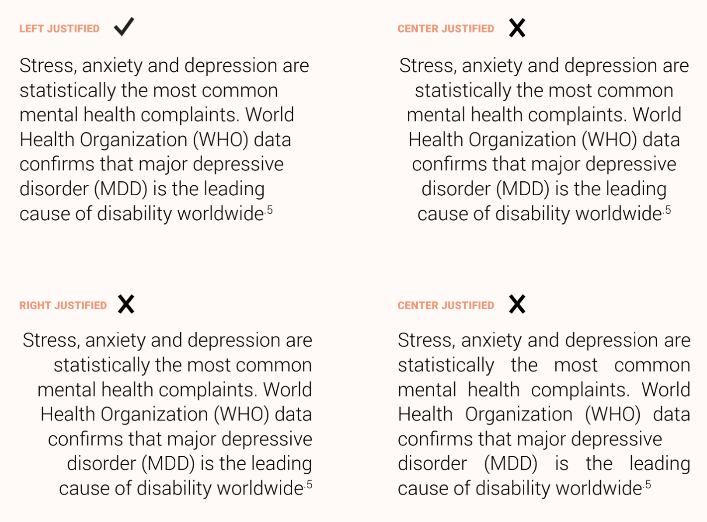
Justification
Justification refers to the alignment of the type in relation to the margins of the text column.
Copy should be left-justified, ragged right — meaning the type is aligned along the left-hand side of the column, and uneven (or ragged) on the right. This style lends easy readability and should be used instead of centered, right or full justified.
__________________________
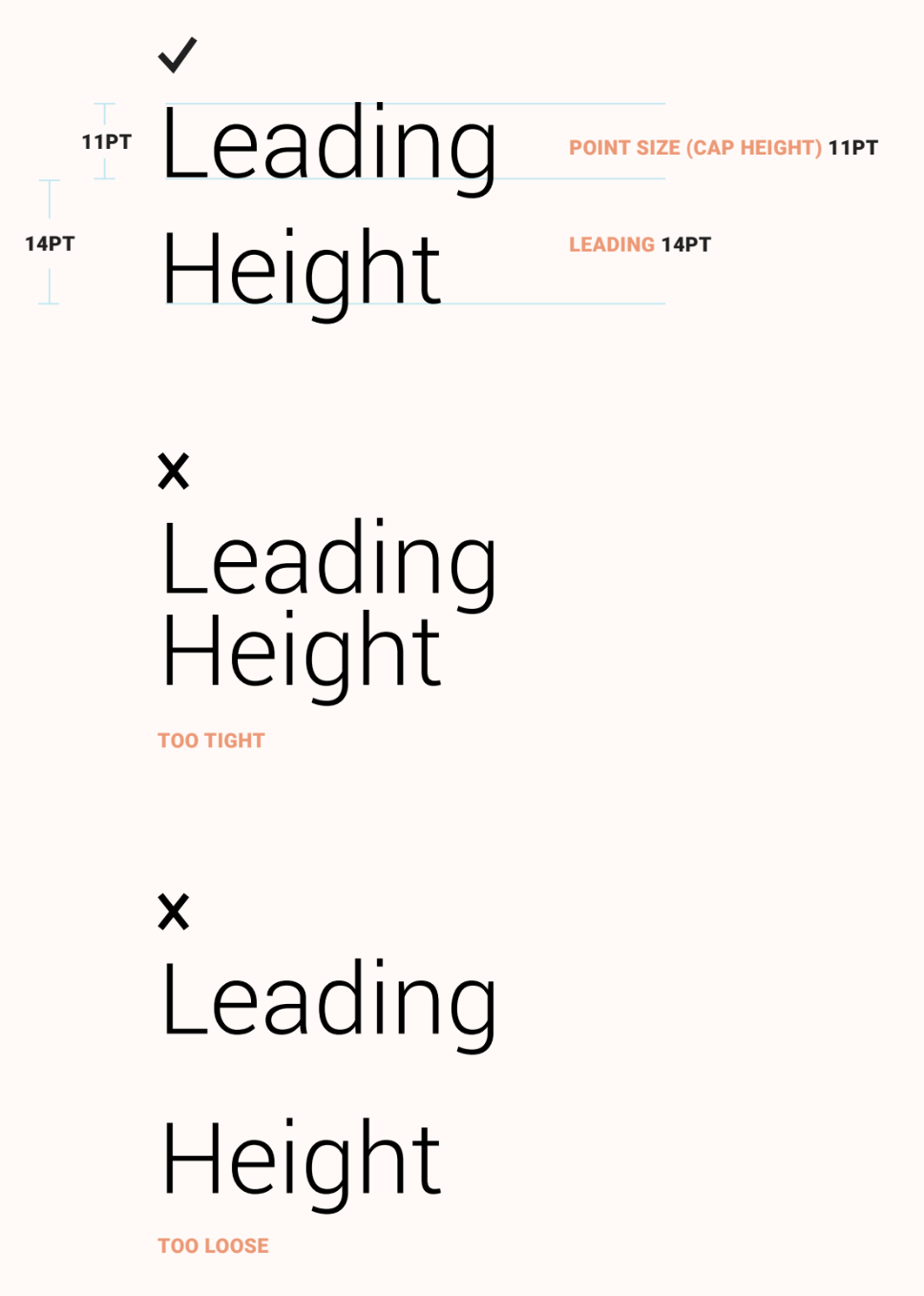
Leading
Leading is the amount of vertical space between lines of type, measured from one baseline to the next.
The point size and leading are typically denoted as 11pt / 14pt, or “eleven over fourteen".
_______________________________________
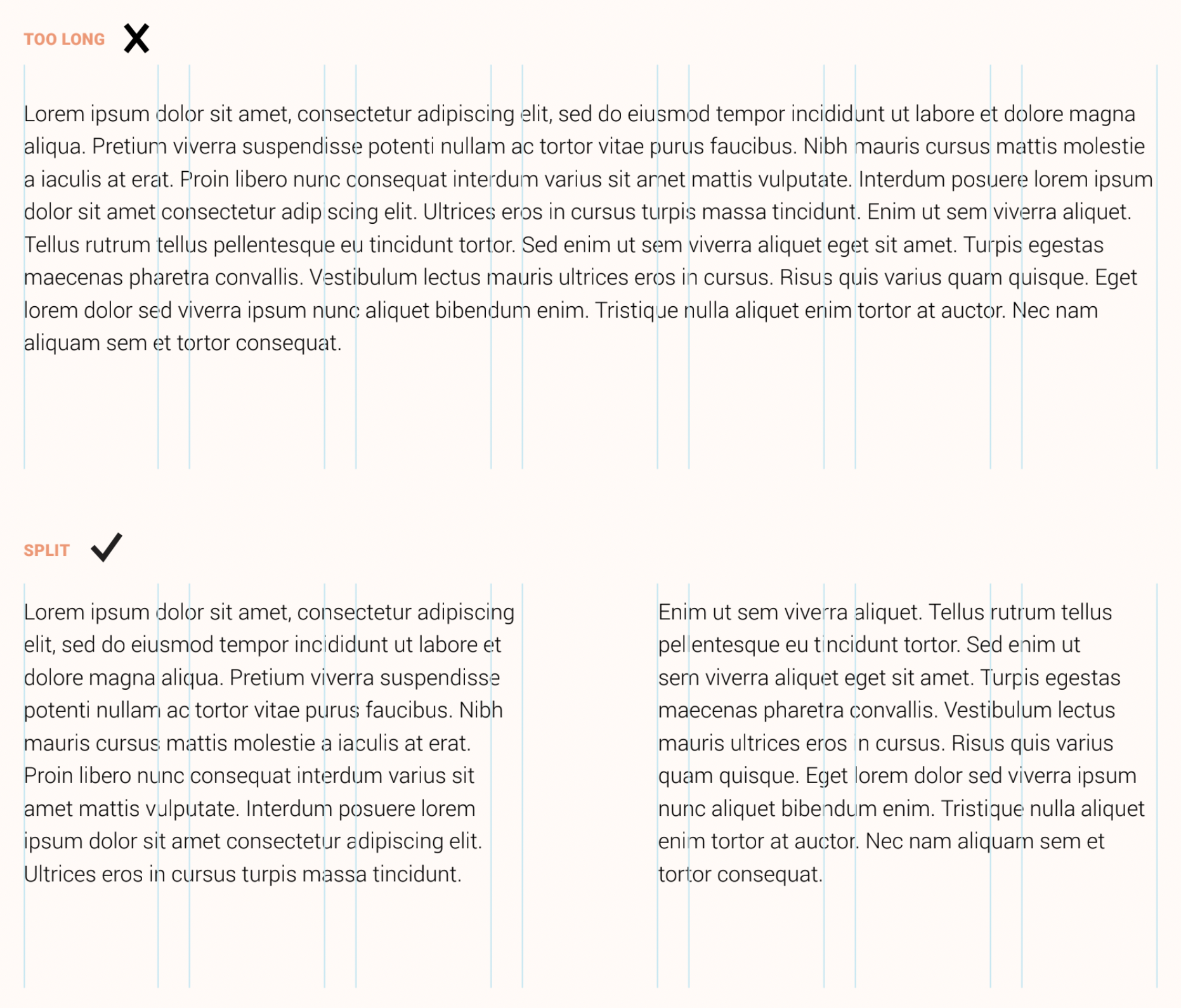
Line Length
Proper line length is crucial to readability. The length of a line of copy in a paragraph, as measured by the number of characters it contains, determines the ease with which the reader’s eye can find the next line of type. Overly long line lengths make this difficult, causing readers to skip lines or re-read lines. Roughly 9-15 words across, or about 50-75 characters, is ideal.
Instead of running body copy across the width of a page, break the lines into manageable lengths by using columns of type that align to the document grid.
___________________________
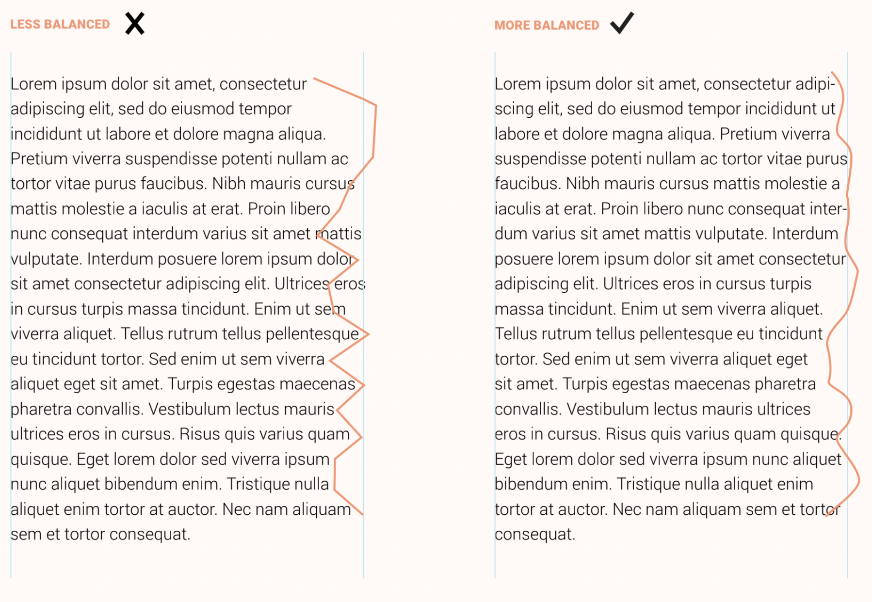
Rag
Rag refers to the overall shape of the unjustified side of a block of text. A good, balanced rag zigs and zags from line to line in small increments, while a poor rag creates distracting blocks of white space along the margin, lead-ing to an untidy and less readable appearance.
_______________________________________
Print-Based Typography Hierarchy
Generally speaking, in screen-based applications, there should be fewer distinct levels of typography on a given page, and type sizes should be more generous to ease the strain on readers’ eyes.
_____________________________
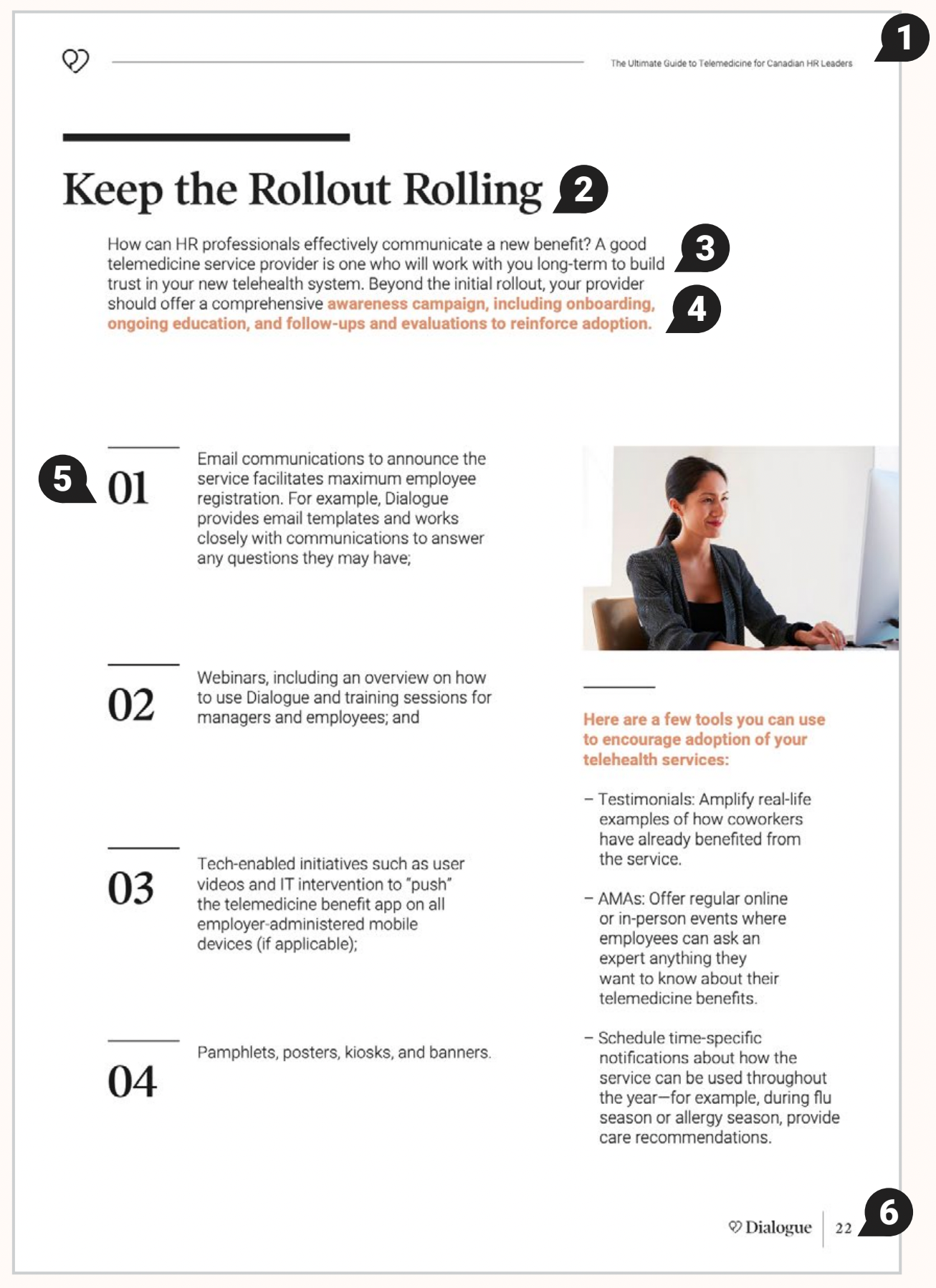
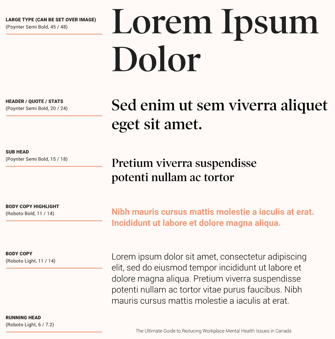
Paragraph Styles
Paragraph style names correspond to the levels of hierarchy described on the previous pages.
1 Running Head
2 Header
3 Body Copy
4 Body Copy Highlight
5 Header Number
6 Page Number